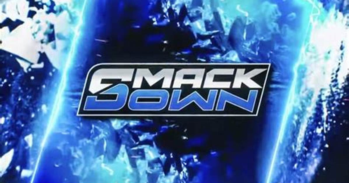
If you're a fan of the blue and grey color scheme, fret not. The logo wasn't drastically changed to something fans can't identify. RAW is still very much the "Red" brand and SmackDown is still rocking Blue. The font has decidedly changed, however, as it's been given a more "aggressive" look.
The letters appear to have been carved out of concrete and metal, and the exclamation point has been incorporated into the middle of the word "SmackDown" as it shares double-duty with the "D."
It's definitely a grittier rendition of the logo, and fans seem to like it.
It's important to note that this isn't the "official" logo per se. However, it's hard to imagine that it won't stick, especially after Fox has been blasting it on social media and in advertisements.

